Until very recently (around 24 hours, give or take), the appearance of the site's classifieds sections was the same as that when viewed on my desktop computer. In the last day, it looks like the presentation as viewed on my phone is significantly different. Things are larger. Information immediately shown is less, for lack of a better word, rich. Is information being presented differently to mobile devices now? I thought it was just me (and I am full of self-doubt) at first, but another member just asked me about it and that leads me to believe this is probably not a coincidentally shared hallucination.

-
Responding to email notices you receive.
**************************************************
In short, DON'T! Email notices are to ONLY alert you of a reply to your private message or your ad on this site. Replying to the email just wastes your time as it goes NOWHERE, and probably pisses off the person you thought you replied to when they think you just ignored them. So instead of complaining to me about your messages not being replied to from this site via email, please READ that email notice that plainly states what you need to do in order to reply to who you are trying to converse with.
-
IMPORTANT! PLEASE READ!! About the Google Adsense ads being displayed
=====================
Posted 08/15/2025
=====================
Yeah, I know. They are a pain in the butt. But they pay the bills to keep my server running. Just a fact of life, I am afraid.
Want to get rid of them? Simple. Just become a Contributor level member or above and they will be gone. -> Please click HERE."
Is that too much for me to ask of you to keep this site running? Well, sorry about that. I too wish I could get everything for free. But alas.....
=====================
Addendum: 01/10/2026
=====================
Google Adsense ad revenue for December, 2025 was just $30 over the cost of the lease for the server running this site. So, in effect, the money providing the incentive for me to continue running this site is coming SOLELY from the paid memberships and sponsorships here. Which honestly ain't much....
You are using an out of date browser. It may not display this or other websites correctly.
You should upgrade or use an alternative browser.
You should upgrade or use an alternative browser.
Change to mobile device appearance/format?
- Thread starter nickolasanastasiou
- Start date
Also, it looks like side ads vanished on my phone's version.
I will take and post some screenshots in a bit.
I will take and post some screenshots in a bit.

My programmer is working on trying to make this site more mobile friendly.
Naturally I am interested in hearing feedback from as many people as possible whether the changes are a step in the right direction or not.
Personally, I do not use my phone for my general internet access, so I am not going to be seeing the changes myself. I'll be damned if I am going to give up a full sized keyboard and my 28" 4K screen for all the internet stuff I do every day. So I really do need the feedback from all of you about this. This mobile stuff will not make a bit of difference to me in the least. But my programmer tells me I really NEED to do this, so here we are.
Brokbakman
Member
You can go to your settings and place it into desktop mode and you'll be able to view it like before. I wish I could take credit but I am technology disabled and my tech savvy girlfriend showed me. I prefer the desk top mode .
NCVenom
Member
I personally liked the old way better. But that's just me.
I only use my phone or iPad, I don’t own a computer. I had to request a desktop site, I was as lost as last years Easter eggs.
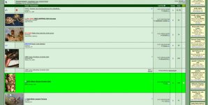
There are now 2 versions of the site: Desktop and Mobile versions.
When you visit forum with a normal computer (or some large screen tablets), you'll get desktop version which is the normal skin you were always getting.
If you visit the forum with a mobile device with a smaller screen (iphone, android phone etc.), mobile version will load, and site appearance will fit to your screen so that you don't need to scroll right or left to read. If you still prefer desktop version even if you are in mobile, you can do that in one of these ways:
1- Open your mobile browser menu and click "request for destop version". Most mobile browsers have such an option and if you click it, normal desktop version will load for you even if you are on mobile.
2- Scroll bottom of the page, find section that says "All times are GMT xxx. The time now is xxxx." and at the end of that line you'll see a link for "DESKTOP VERSION", click on it, and desktop version will load for you.
Mobile version is lighter on graphics etc so that it can fit to your screen. So it misses some features desktop version has (eg. user avatars are not displayed in posts, image attachments require clicking to open etc.). This has to be that way because mobile screens are small and we need to omit some info for these screens to display them in a readable format.
Likewise some sections are repositioned as mobile screens can't have "columns" which scoll the page to left. For instance ads on the left, is now in the bottom of every page.
This is basically how mobile skins work. You prevent users to scroll left-right in their phones in their small sceens, you place content from top to bottom so that scrolling only occurs vertically.
NCVenom
Member
Ahh much better. Thank you for your help.
Kfen
Member
I was going crazy, glad I found this thread. While I'm sure over time I would get used to the mobile view and find some benefits, the fact that I have to click on every image to view it will always stop me from using the mobile version.
Thanks for confirming I was not the only person seeing the change and why, all.
Please bear in mind that other changes are in the works. For instance, I likely will be changing the way Google ads appear on the site. This may or may not be burdensome to some viewers, as a lot of this stuff is just "let's try it and see if it works better". Of course, "better" is subjective. It may be that more aggressive and intrusive ads are "better" from a financial aspect for this site, and maybe not so much for the general viewership. I know I have gone to sites where the ads were so overpowering and a pain in the butt enough that I don't go there as much as I would otherwise. But maybe I'm just an old crotchety SOB more so than most other people these days.  To be honest, when I go to a site that is obviously geared to the mobile generation, I'm not real keen on going back to those sites neither.
So we will see. I will be watching the feedback from you all about the changes and make decisions accordingly.
To be honest, when I go to a site that is obviously geared to the mobile generation, I'm not real keen on going back to those sites neither.So we will see. I will be watching the feedback from you all about the changes and make decisions accordingly.
AppEcto
Active member
While I'm sure over time I would get used to the mobile view and find some benefits, the fact that I have to click on every image to view it will always stop me from using the mobile version.
Ditto
My guess is that those viewers only paying for a limited data service for their cell phones might appreciate it, however. Viewing images can chew through your data allocation pretty quickly.
Being able to easily switch to desktop view at the bottom of the page works for me. I don't care for the other version at all. I like to see all the information associated with a listing immediately. All the extra link-clicking and waiting is too annoying.
MidnightRoseExotics
New member
I am not a fan of the mobile format so far to be honest. Having to click into photos is a pain, especially depending on your connection. Not being able to see the columns is a pain when an add is labeled with just a morph that could apply to anything from boas, to pythons, to colubrids. So having to click into an ad just to see what species they're talking about is aggravating (I am always using the What's New feature, so not in a particular species sub thread).
The only gripe I had with the classic format was that I couldn't search when on mobile. Everytime I'd try to pull up the keyboard to search it would disappear. Otherwise, I really preferred the original version.
The only gripe I had with the classic format was that I couldn't search when on mobile. Everytime I'd try to pull up the keyboard to search it would disappear. Otherwise, I really preferred the original version.
Kfen
Member
The only gripe I had with the classic format was that I couldn't search when on mobile. Everytime I'd try to pull up the keyboard to search it would disappear. Otherwise, I really preferred the original version.
I had that problem too. The way around it is to type your search terms into something else, copy it, and then you are able to paste it into the search field without bringing up the keyboard.
Feedback on the changes that have been made to the site recently? Modifications were put into place to try to make it more mobile friendly here (which I believe people were asking for), and there were also so changes made concerning how the Google Adsense ads are distributed and displayed. The Google Adsense changes were made to try to make up the shortfall from decreased traffic, paid memberships, sponsorships, etc. over the last few years.
Honestly, since I only use a desktop for my internet access, I am not going to see much, if any changes myself. So I am really not seeing any changes at all myself in order to be able to critique what you guys may be seeing. So I would appreciate any feedback that you guys have to share so I can figure out if we are going in the right (or better) direction or not.
Honestly, since I only use a desktop for my internet access, I am not going to see much, if any changes myself. So I am really not seeing any changes at all myself in order to be able to critique what you guys may be seeing. So I would appreciate any feedback that you guys have to share so I can figure out if we are going in the right (or better) direction or not.
I’m really dissatisfied with Fauna Classifieds since you started to post so many advertisements. Also hard to scroll through the reptile classifieds. To many adds.
> I hope You will return Fauna Classifieds back to what it once was.
> It went from a B+ site, to a D- site. I feel you will loose clients if you don’t change something.
> Hope you take my thought into consideration.
> Best Regards; Robert Bichler
> I hope You will return Fauna Classifieds back to what it once was.
> It went from a B+ site, to a D- site. I feel you will loose clients if you don’t change something.
> Hope you take my thought into consideration.
> Best Regards; Robert Bichler
Well, I have to see feedback before I would consider asking my programmer to roll back the work he did for me. If there is not a lot of dissatisfaction with the changes, my inclination would be to let it ride as it is to see how things go after folks get used to the change.
As I mentioned before, I don't see any changes myself on my desktop.
As I mentioned before, I don't see any changes myself on my desktop.